搭建组件库文档
前言
在我们开发完一个组件库的时候,需要有一个组件说明文档,文档页面是最直接的获取信息的窗口。而文档页一般包含了这些信息:
- 组件的描述
- 组件 Demo 示例的展示、描述和源码
- 组件的参数文档
组件说明文档是让其他人了解组件库的关键环节,包括组件库的适用范围(pc端,移动端,轻量级还是重量级),兼容浏览器的版本,设计原则和背景,以及社区生态,使用方法等。
关于如何开发组件库,可看这篇:
文档生成
这里推荐 vuepress ,可以快速帮我们完成组件库文档的建设。(https://vuepress.vuejs.org/zh/guide/)
vuepress是一个文档生成工具,默认的样式和vue官方文档几乎是一致的,因为创造它的初衷就是想为vue和相关的子项目提供文档支持。它内置了 Markdown的扩展,写文档的时候就是用 markdown来写,最让人省心的是你可以直接在 Markdown 文件中使用Vue组件,意味着我们的组件库中写的一个个组件,可以直接放到文档里去用,展示组件的实际运行效果。 我的案例网站也就是通过vuepress来写的,生成静态网站后,用 gh-pages 直接部署到github上,也可以直接部署到我们自己的网站上。
vuepress更好的一点在于你可以自定义其webpack配置和主题,意味着你可以让你自己的文档站点在开发阶段有更多的功能特性的支持,同时可以把站点风格改成自己的一套主题风格。这就无需我们重头开始去做一套了,对于咱们想要快速完成组件库文档建设这一需求来说,还是挺有效的。
VuePress搭建文档
VuePress 是 Vue 驱动的静态网站生成器。支持在 Markdown 中使用 Vue 组件,简洁,高性能。当然你也可以使用其他的文档生成器,如 Docz、Storybook 等。
可以根据官方文档学习如何使用:https://www.vuepress.cn/guide/getting-started.html
项目生成及配置
安装
可以右键手动新建,也可以使用 mkdir 命令新建:
1 | mkdir heavenUi && cd heavenUi |
全局安装VuePress
1 | npm install -g vuepress |
进入 vuepressBlogDemo 文件夹,初始化项目
使用 npm init 或 npm init -y(默认yes)
1 | npm init -y |
配置scripts
package.json
1 | { |
初始化docs
创建目录和文件如下图所示
VuePress 遵循 “约定优于配置” 的原则,推荐的目录结构如下:
1 | . |
注意
请留意目录名的大写。
- docs/.vuepress: 用于存放全局的配置、组件、静态资源等。
- docs/.vuepress/components: 该目录中的 Vue 组件将会被自动注册为全局组件。
- docs/.vuepress/theme: 用于存放本地主题。
- docs/.vuepress/styles: 用于存放样式相关的文件。
- docs/.vuepress/styles/index.styl: 将会被自动应用的全局样式文件,会生成在最终的 CSS 文件结尾,具有比默认样式更高的优先级。
- docs/.vuepress/styles/palette.styl: 用于重写默认颜色常量,或者设置新的 stylus 颜色常量。
- docs/.vuepress/public: 静态资源目录。
- docs/.vuepress/templates: 存储 HTML 模板文件。
- docs/.vuepress/templates/dev.html: 用于开发环境的 HTML 模板文件。
- docs/.vuepress/templates/ssr.html: 构建时基于 Vue SSR 的 HTML 模板文件。
- docs/.vuepress/config.js: 配置文件的入口文件,也可以是 YML 或 toml。
- docs/.vuepress/enhanceApp.js: 客户端应用的增强。
首页信息设置
1 | --- |
首页效果如下
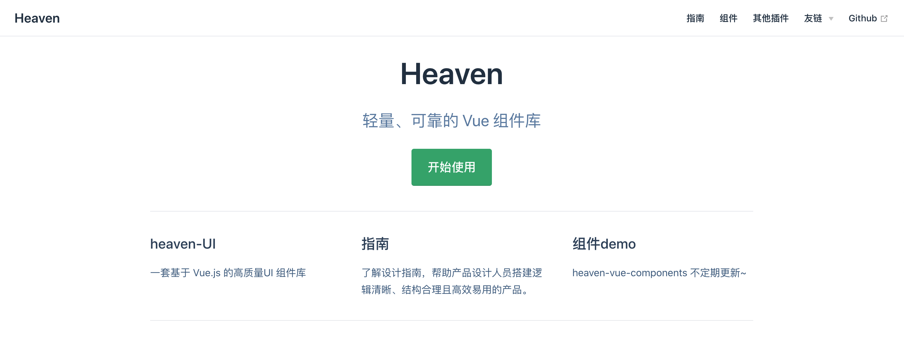
配置导航
1 | module.exports = { |
客户端应用的增强文件
enhanceApp.js
这个文件用于添加组件Demo展示的优化的配置
安装
1 | npm install heaven-ui less less-loader --save |
如需本地调试,可link开发的组件库 heaven-ui
1 | npm link heaven-ui |
.vuepress/enhanceApp.js
1 | /** |
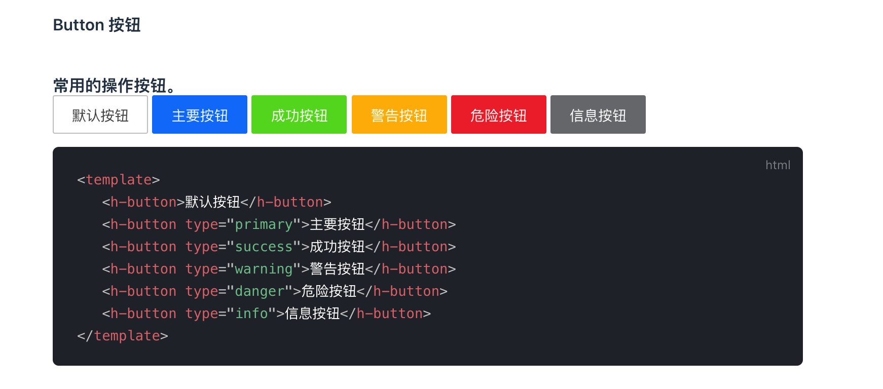
.vuepress/components/button.vue文件可以进行button组件的Demo展示的样式
在md文件内增加
1 | <template> |
编写对应组件的Markdown文件
1 | #### Button 按钮 |
效果如下
访问 http://localhost:8080 即可看到文档了。当然,可以将文档部署到自己的服务器,也可以部署到 Github pages 上。
小结
至此,组件库的说明文档就搭建完成,后续自行补充文档即可。